How to use the Greek key motif in modern home decor
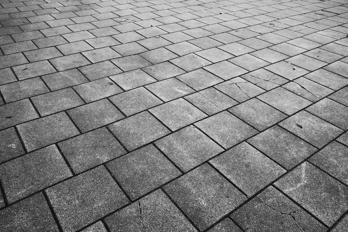
The Greek key divides people. Say the words and one person pictures a 1980s bathroom border in glossy cream and gold; another pictures a fifth-century vase. Both are reasonable. The motif — a continuous line that turns back on itself in a squared spiral, also called a meander or Greek fret — has been copied so often and so cheaply that its geometry gets lost in the noise. Handled with a little discipline, though, it is one of the most useful decorative devices you can bring into a contemporary room: crisp, architectural and far easier to live with than its reputation suggests.
“Greek key” covers a family of patterns, and they behave very differently in a room. Knowing which one you are looking at saves a lot of regret.
A thin single line is the safest and the most elegant. An oversized single motif — blown up until the corner turns are almost abstract — is the boldest and the most contemporary. The versions in between, chunky and evenly repeated, are the ones that tip a room towards the past.
Scale does more work here than colour. A fret border a centimetre or so deep reads as trim: it behaves like a piped edge or a picture rail, and your eye accepts it as structure. Blow the same pattern up to ten centimetres and repeat it around a whole room and it starts to shout.
So decide the job first. If you want the motif to act as a quiet finishing detail, keep it small and use it once — along the leading edge of a worktop, around a tray, on the underside of a shelf. If you want it as the main event, go genuinely large, pick a single repeat, and give it space. Half-hearted middle sizes are what make a room feel dated.
Some surfaces suit the pattern better than others. These are the placements that tend to work hardest in modern interiors:
The quickest route to dated is high contrast in shiny materials: gold on cream, black on white, anything with a sheen. Instead, drop the motif into a tonal scheme, where it reads as texture rather than decoration. Ink blue on a slightly lighter blue. Putty on chalk white. Forest green on sage. The pattern is still there; it just stops performing.
Finish matters as much as colour. Matte paint, unglazed ceramic, wool, jute, brushed brass and unlacquered metal all soften the geometry. If you do want metal, use it once and keep it small — a keyed edge on a mirror, a drawer pull, a slim inlay.
Deep, saturated colours also help. Terracotta, oxblood, aubergine and charcoal make the motif feel deliberate and slightly antique, in the good sense, without pushing it towards pastiche.
The Greek key is a strong geometric, so it wants calm around it. Plain linen, bouclé, plaster, limewash, oak, warm white walls: all reliable. It also sits comfortably with quiet patterns at a much smaller scale — a fine stripe, a tiny spot, a subtle weave — because the difference in scale keeps them from fighting.
What it does not like is competition. Two bold geometrics in one sightline, or a keyed border next to a heavily patterned wallpaper, will make the whole room feel busy and slightly unresolved. When in doubt, remove something else.
The most common mistake is repetition across a whole scheme: the rug, the cushions, the tiles, the lampshade, all singing the same tune. The pattern loses its authority and the room starts to look like a showroom from another decade.
Choose one anchor — usually the floor or the wall — and let that be the only place the motif appears at full strength. You can echo it once at a much smaller scale, such as a braid on a cushion or a trim on a blind, and that echo will feel considered rather than repetitive. Two appearances is plenty.
If you are keen but cautious, work in this order.
The Greek key is a piece of visual punctuation. Used once, at the right scale, in a restrained palette, it gives a modern room a line to follow and a hint of something older underneath. Used everywhere, it becomes the thing everyone remembers about the nineties. The difference is almost entirely in the editing.
Photo: MabelAmber / Pixabay
Previous Post
Beginner's guide to identifying common design motifs
Next Post
Floral motifs in textile design: a beginner's guide to repeat patterns