Floral motifs in textile design: a beginner's guide to repeat patterns
A floral fabric is never just a flower. It is one flower — or one stem, one sprig, one bunch — drawn once, then repeated across the cloth in a rhythm the designer chose. That rhythm is the repeat, and it does more work than most people realise. It decides whether a curtain looks stately or scattered, whether cushions sit calmly or buzz, and whether your seams line up or argue. Learn to read a repeat and choosing floral textiles stops being a matter of luck.
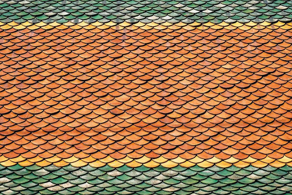
A repeat is a tile. The designer draws one unit — a peony with two buds and a leaf, say — and that unit is printed or woven again and again across the width of the cloth and along its length. Its measurements are given as a vertical repeat (how far down the pattern travels before it starts again) and a horizontal repeat (how far across).
Keep three words separate in your head. The motif is the individual flower or leaf. The repeat is the tile containing it. The layout is how those tiles are stacked — and layout is where most of the character comes from.
Fabric selvedges often carry the repeat measurement, printed or woven along the edge of the roll. If yours doesn't, measure it yourself: pick one clear flower and measure to the matching flower above it. A repeat of 8cm and a repeat of 60cm will behave completely differently on the same chair, even when the drawing is identical.
Almost every floral print you meet will be one of these. Once you can name the layout, you can usually predict how the fabric will read at a distance.
Measure the repeat, then look at the fabric from the distance you will actually view it. A small sprig seen across a room becomes texture; the same sprig on a large sofa can turn into visual noise. A huge repeat chopped into a small cushion may show you a leaf and half a flower, with no complete bloom anywhere. As a rule, a cushion panel should contain at least one whole motif, and a curtain should show several repeats down its length so the pattern reads as a rhythm rather than an accident.
Large repeats also cost more than the ticket price suggests, because matching them at seams wastes cloth. Buy extra, and buy it in one order.
Many florals are directional: they grow upwards, or lean one way. Turn a piece of the fabric through 180 degrees and look again. If the flowers look wrong, the design is directional, which means every cushion back, valance and Roman blind has to be cut the right way up. Non-directional prints are far more forgiving for beginners.
Ask what the flowers sit on. The same drawing on a cream ground reads fresh and light; on a deep ground it turns dramatic. Count the colours, too — a two-colour print sits quietly with almost anything, while a six-colour floral needs a room with space for it. Then check the edge of the cloth: many prints finish with a part-motif at the selvedge, which is fine for upholstery but matters if you need a clean, uncut flower at every seam.
Two or three florals in one room can look wonderful; five usually looks like a jumble sale. Keep the count low and give the patterns something in common:
Consider weight as well. A fine floral cotton on a heavy armchair can look underfed, while a bold woven floral on a delicate chair can overpower it. Fabric and furniture should feel as though they belong to the same conversation.
Take your time with step two. A floral that looks charming on a small sample can be a different fabric entirely once a metre of it is hanging in your room — and the repeat is usually the reason.
Photo: monicore / Pixabay
Previous Post
How to use the Greek key motif in modern home decor
Next Post
What does the paisley motif symbolise? History and meaning explained