Art Nouveau motifs: 7 defining features to spot in architecture and design
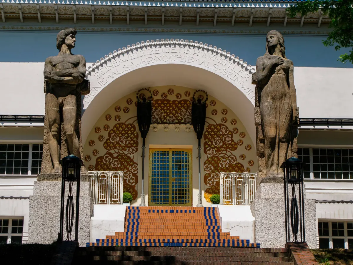
You are standing in front of a townhouse in Brussels, a shopfront in Paris, a tearoom in Glasgow. Something about the ironwork catches your eye. It does not sit still. It grows. The lines curve, thicken, thin out and curl back on themselves like a vine looking for light. That is the first clue. Art Nouveau flourished roughly from the 1890s until the First World War, and it left its fingerprint on buildings, posters, jewellery, furniture and metro entrances across Europe. It was never a single style, but it has a recognisable grammar. Here is a checklist of the motifs and habits that define it.
The signature motif is the whiplash: a long, sinuous curve that snaps back on itself. It is not a gentle arc. It has tension, like a stem bent almost to breaking. You will see it in the ironwork of Victor Horta’s Brussels townhouses, in the spidery lettering of Alphonse Mucha’s posters, and in the tangled railings of Hector Guimard’s Paris Métro entrances.
Look for this line in unexpected places: stair balusters, radiator covers, picture frames, the handles of ceramic jugs, the borders of stained-glass windows. A single curve can carry the whole design.
If a line looks as though it could be drawn in one breath, but still has a flick or a snap at the end, it is probably Art Nouveau. If it is symmetrical, static and mathematical, you are more likely looking at the Beaux-Arts or Arts and Crafts traditions.
Art Nouveau designers were obsessed with nature, but they rarely copied it. They simplified it. A poppy becomes a bold red circle with a curling stem. An iris is stretched into a vertical rhythm of petals and leaves. Lily of the valley, thistles, vines, seaweed, dragonflies and peacock feathers all appear, but they are pressed into service as pattern.
This is why Art Nouveau can feel both organic and artificial at the same time. The motif is a plant, but it has been through a designer’s mind. Émile Gallé’s glass, with its layered petals and insects, is a good example. So are the repeating wallpapers and textiles of the period, where a single stem is mirrored, rotated and stretched across a surface.
Victorian design loved symmetry. Art Nouveau prefers balance without mirroring. A façade might have a doorway pushed to one side, with a mosaic panel that spills across the wall. A fireplace surround might be heavier on the left than the right. The eye is kept moving.
This asymmetry is not chaos. It is rhythm. Designers repeated a motif at different scales: a large curve on a balcony, a smaller version on a door handle, a tiny echo in the tiles. Look for that sense of movement, as though the building or object is mid-gesture.
Many Art Nouveau posters, panels and pieces of jewellery feature a woman with long, waving hair. Her hair is often the motif: it becomes tendrils, ribbons, smoke or water. Alphonse Mucha’s posters made this image famous, but you will also find it in René Lalique’s jewellery and in the carved figures on furniture.
The figure is usually idealised and symbolic rather than realistic. She might represent nature, spring, music or a brand of biscuits. When you spot her, look at how her hair is drawn. If it curls into the same whiplash lines as the ironwork, you are in Art Nouveau territory.
Art Nouveau designers loved materials that could be coaxed into organic shapes. Wrought iron and cast iron were bent into tendrils. Glass was blown, etched and layered to look like petals. Wood was carved into sinuous mouldings. Ceramic tiles were glazed in deep greens, blues and golds.
Look for mixed materials on a single surface: iron and glass, wood and pewter, ceramic and silver. Techniques such as marquetry, cameo glass and enamelling were used to add colour and texture. The craft is often as important as the image.
Perhaps the most reliable clue is repetition across scales. Art Nouveau architects often designed everything: the façade, the hallway, the staircase, the furniture, the light fittings, the cutlery and the textiles. This idea of the total work of art—Gesamtkunstwerk—means that a single motif can travel from a stone carving above a door to the handle of a spoon.
Victor Horta’s Hôtel Tassel in Brussels, Charles Rennie Mackintosh’s Hill House in Helensburgh, and Antoni Gaudí’s Casa Batlló in Barcelona all show this approach. If you see the same curve on the outside and the inside, you have found a strong example.
Art Nouveau took on different flavours depending on where it grew. Knowing the local accent can help you date and place a building.
Look for exuberant ironwork, glass roofs and curved staircases. Brussels and Paris are the heartlands, with Horta, Guimard and the Nancy school of glass and furniture.
The Glasgow style is more geometric. Charles Rennie
Previous Post
What does the paisley motif symbolise? History and meaning explained
Next Post
Common mistakes when mixing geometric and floral motifs in a room